Design Statement
How can I design a digital experience that eases the burden of finding information during a crisis and lets users feel more secure in their decisions before, during, and after an emergency?
During COVID-19 I realized how important it is to get quick, reliable, and relevant information that can impact the public's health and safety. This global emergency has been a new experience for so many people and has illuminated our dependence on the government and reliable sources of information for decision-making. I started considering how I am new to the state of California and many of the common disasters that are unique to this area, like earthquakes and wildfires. After experiencing the Bobcat Fires in the fall of 2020, I decided that I wanted to design a website that could be useful to people who are also experiencing disasters that are unfamiliar to them.
This project seeks to help users identify potential disasters happening near them or their loved ones and offer features that could help them in preparation before an emergency situation occurs. Users' needs are situation-specific and thus it's important that these diverse needs are met depending on the urgency of the disaster they may be experiencing or are about to experience. This tool could change how people find information about disasters and may offer services that could save lives in the future.

Competitor Analysis
The resource that inspired this project was DisasterAssistance.gov, which is a government site that lets users find valuable information on different disasters and apply for federal aid. During my heurisitic analysis I realized that this site is incredibly flawed and can be difficult to navigate and perform actions with. I wanted to create a new type of resource that includes the valuable information from this site, but with a more intuitive layout and modern design.
This website taught me that there is a deluge of valuable information that could be lifesaving in emergency situations, but that the process of finding and digesting this information is very overwhelming in its current format. My hope in creating this site is to remedy this negative experience by offering streamlined services that can help users confidently make decisions during extremely stressful situations.

User Research
An important part of the design process is to talk with your users to understand their wants and needs. I conducted a remote interview over Zoom with a target user who lives in the Midwest to gain more insights on how they would approach searching for information regarding a disaster.
This interview taught me a lot about what a user would be looking for in a website like mine and how they would accomplish different tasks. I used techniques like user observation and an interview to ask insightful questions and engage in conversation with the user. Conducting this user research with someone who hasn't experienced many nautral disasters helped me tremendously by giving me perspectives of someone who is completely new to using this type of resource.

Personas and Scenarios
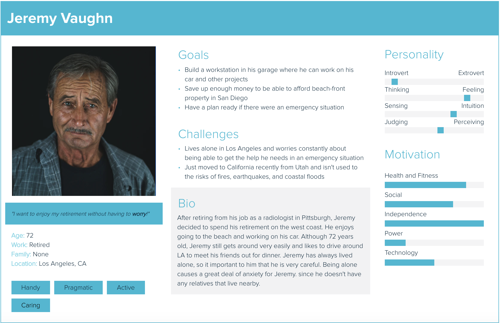
Storytelling is a critical part of user research and design. I created user personas and journey maps to help me empathize with my users and better understand situations that would drive them to my website. These tools can provide valuable context that is essential for developing resources to help them achieve their goals.
These personas and user journey maps were created based on valuable information I gathered from my contextual inquiry. I came up with two personas that were synthesized from the needs identified by the user I interviewed, in addition to my goal of designing the website for middle-aged and older adults living in the United States. Ultimately, I wanted to create these personas and journey maps to better understand the flow of decision-making for these users so I could make their experiences the most efficient and rewarding.

Wireframes, Wireflows, and Low-Fi Prototype
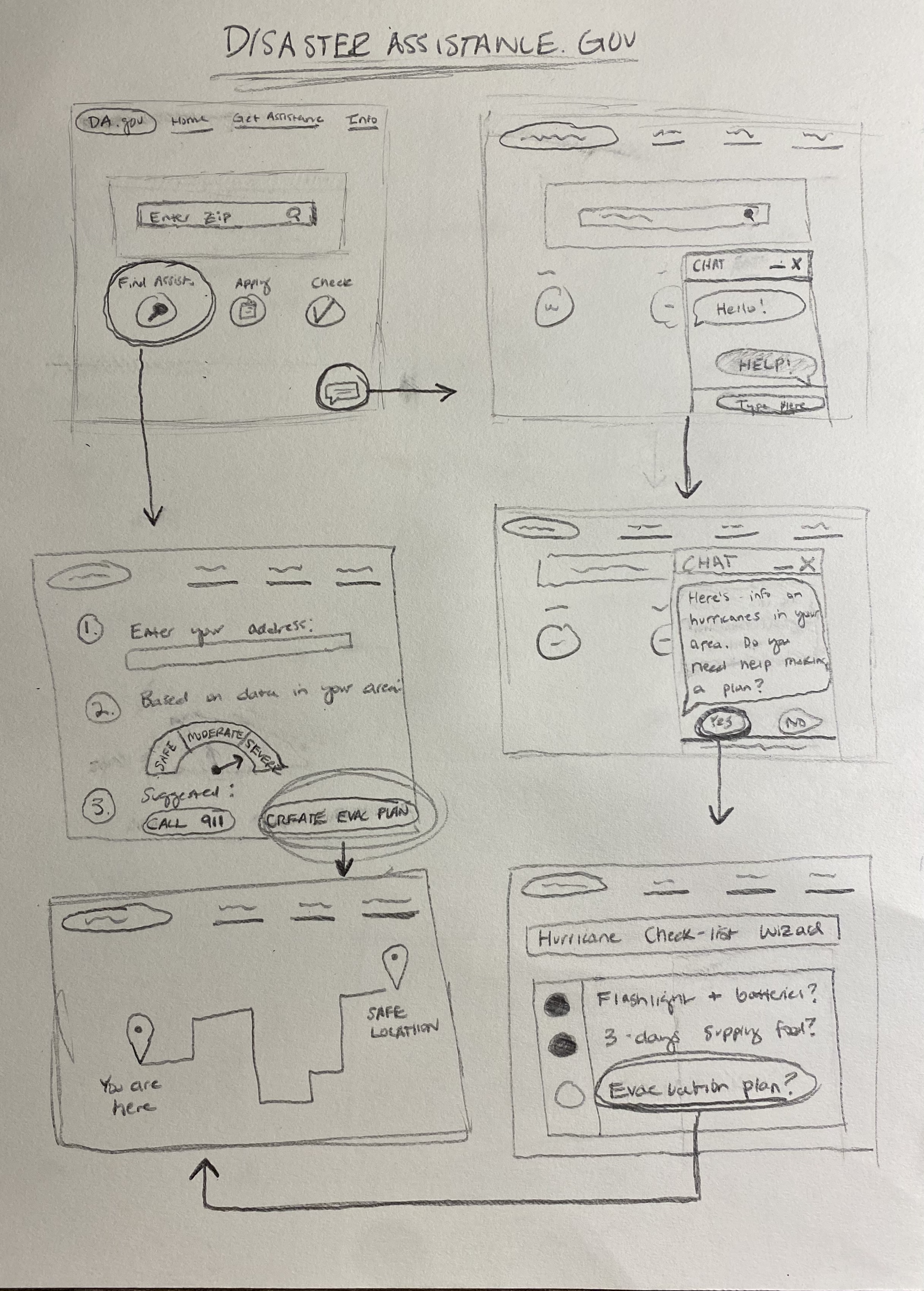
My personas helped me conjure up three key features of the website that I wanted to offer to users:
- An AI Chat function that allows a user to input data and points them to other parts of the website with real-time answers that are specific to them
- A Check-List Wizard that walks users through important action items to consider in preparation before, during, and after a disaster
- An Evaluation Tool that tells a user how severe their situation is based on their location by using each disaster's unique scientific scales, including the Richter Magnitude Earthquake Scale, Saffir-Simpson Hurricane Wind Scale, and the Fujita Tornado Scale
- Using the AI Chat feature
- Running through an emergency check-list
- Saving an evacuation route

High-Fidelity Prototype
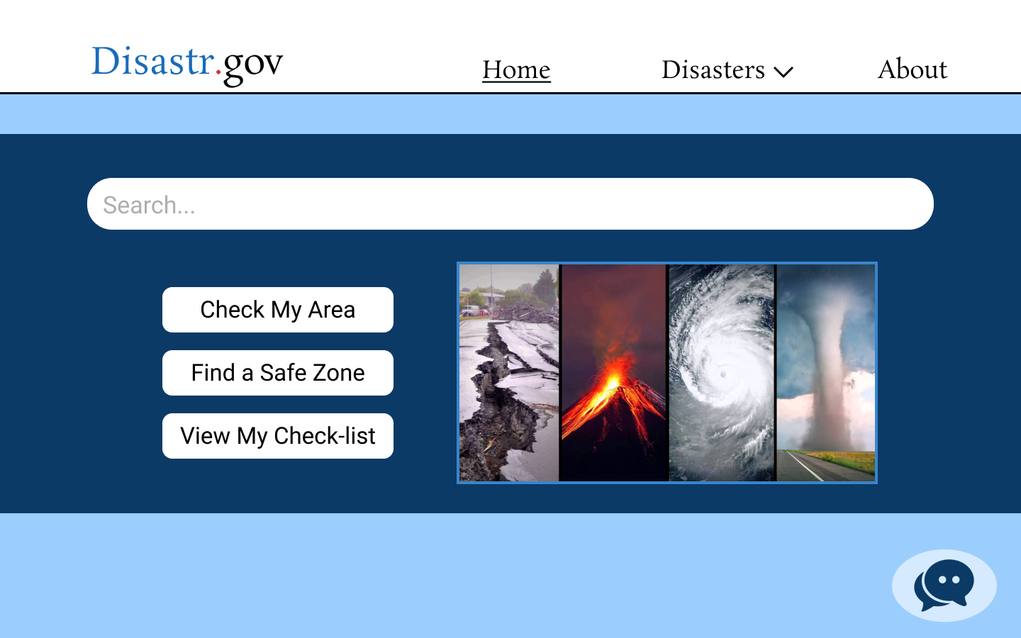
I ended this project by creating a high-fidelity prototype of Disastr.gov using Figma. Althought it isn't exactly the final product, this prototype serves as a manifested form of what this emergency resource would look and feel like. This prototype could eventually evolve into a closer version of a final product of what Disastr.gov could actually be with some more testing and design iterations.
The interactive high-fidelity prototype can be found at the bottom of this page!